Brand design & redesign.
Good branding is essential for the development of your business. Not only does it attract you customer’s attention but it conveys trust and meaning. Holding a consistent brand message across all media and within the minds of your team and your customers is vital for a coherent vision for the future.
We revel in branding design from logo design, through font choices, imagery styling, colour palette and copy tone of voice. We understand that each element is vital to telling your authentic brand story, and in informing the marketing materials you create for the future.
Have a look at our priced ‘Brand Portfolio Packages’ and decide which suits you best.
Portfolio.
The Secret Day Spa
Branding.
A sanctuary of relaxation and indulgence.
At the initial stages, before interiors or remodelling, we were invited to create branding for The Secret Day Spa.
With the spa to be placed in the heart of an evolving and bustling Belmont road, our concept was of a sanctuary of calm and luxury.
The logo: a still hummingbird with metallic gold outlines and flowing font. Promotional materials: including brochure, stationary and magazine articles – were light, airy and warm. The message – “Tranquility and relaxation are essential to your wellbeing, so we have carefully created for you a sanctuary of restful calm and indulgence. Take time for yourself and let us help you to unwind and emerge nurtured and refreshed.”
Lusso Tan
Branding & packaging design.
Luxury layered tanning skincare (from the team behind The Secret Day Spa) that helps to conceal imperfections & enhance the natural skin tone.
We partnered with Lusso Tan from their beginning to create the brand story, logo, tone of voice, font collection, colour palette and packaging.
Lusso Tan wants to make women and men feel good, as well as look good, so the emphasis was toward a light opulence. Influenced by the client’s Italian name choice, we used a light warm base, spacious layouts and gold foiling to evoke an aspirational luxury.
These elegant elements often now sit in maximalist boxes, inspired by continental fashion houses, that we design to explode with pattern and shout from the shelves.
Wardens
Redesign of established brand
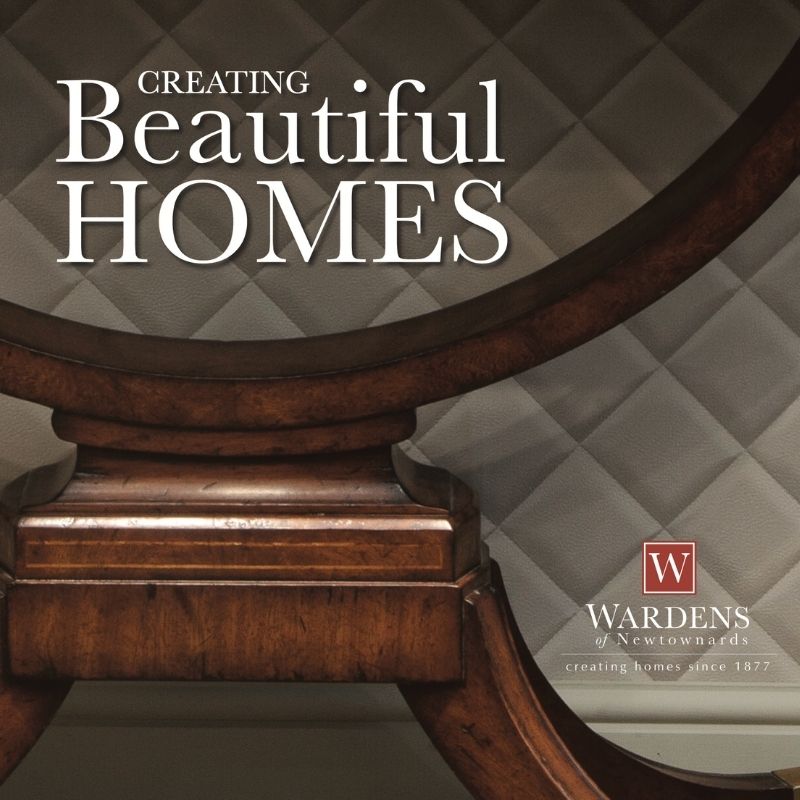
Wardens, the much loved department store in Newtownards, was established in 187. It’s brand had evolved over the decades, but had begun to feel a little out of date when we were invited to revive it with a sympathetic redesign.
With this project we were strongly aware of the attachement loyal customers would have to the existing brand feel and so we found a way to refresh the brand without stripping it of it’s character.
Overall we strengthened the colour palette, chose traditional style fonts with a lighter touch, we advised on product imagery use and gave a full rework to the logo.
For the logo we refreshed the fonts and added the tag line to enhance the brand message. We also chose to create an iconic “W” by refining the font, strengthening the box and adding the slim outlines. This retained a traditional feel but with a more modern sensibility and has allowed the “W” to become a logomark shorthand, used elegantly across marketing channels.

Portadown Wellness Centre
Branding
Portadown Wellness Centre is an exceptional initiative launched to help those living with mental health issues, offering treatment encouragement and support.
We came in pre-launch, producing their branding, website & social media platforms. We designed the branding to be strong, simple and evocative of the goals of the centre – to bring back the sun from behind the cloud. The result is a fresh, recognisable brand that feels both professional and welcoming.
Nichola Hawes Clinic
Branding and promotional material.
Beauty, discretion and professionalism
We were invited to rebrand Nichola’s business to coincide with the launch of her new purpose built clinic space,
The clinic is a highly professional business offering treatments that clients will feel are deeply personal, so we designed the brand to give a sense of this balance.
Our message – this is a person not a faceless clinic, they see you as an individual. Your experience with the clinic will feel clean, reliable, professional, warm & beautiful.
Our approach.
Listen
We kick off with questions, getting to the root of what you feel you need, what you know you want and your understanding of what your audience will respond to, to create a clear vision and brief for your project.
Understand
We complement the brief with our own research into your sector and competition, we may create a moodboard or dive straight into creating first concepts to discuss and critique with you.
Create
We then develop your prefered concept into into final logo artwork. For full branding projects we continue, creating your brand guideline document incl. fonts, colour palette, image style, tone of voice, etc.

Our work.
We love working with different clients and in different sectors, using skills and knowledge acquired over many years. Add in the satisfaction that comes from helping our clients achieve their goals, and this is what motivates all our work.